Algorithmic Influence
The contemporary web is shaped by metrics, A/B testing, and ranking systems that influence hierarchy, typography, motion, and what design is allowed to optimize for.
Visual archive
Visual Archive
Feeds, dashboards, ranking diagrams, and responsive brand systems reveal how contemporary interfaces are tuned around measurable behavior rather than static composition.
Collection object
Collection file
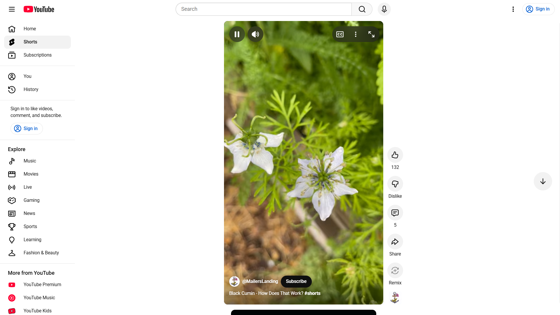
Infinite Scroll Feed
The feed is less a page than a ranking machine. Its design logic privileges continuity, rapid appraisal, and measurable attention.
Infinite Scroll Feed. Short-form feed layouts optimize for continuous attention and rapid interaction rather than bounded page visits. Wikimedia Commons
Collection object
Collection file
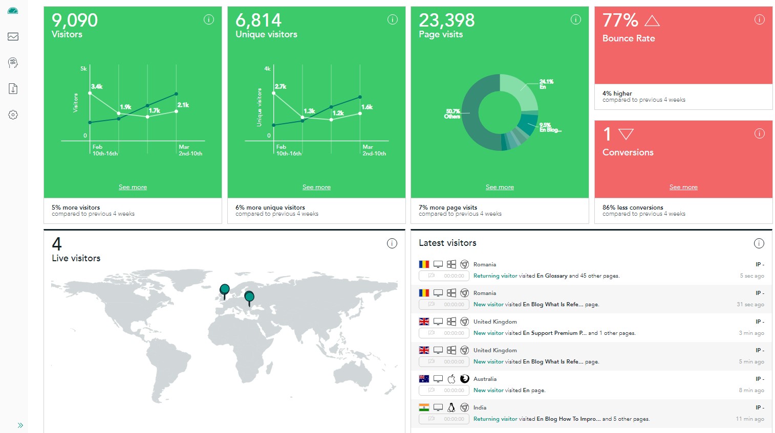
Analytics Dashboard
Dashboards convert behavior into managerial evidence. They explain why clarity, bold type, and modular surfaces became operational imperatives.
Analytics Dashboard. Dashboard interfaces turn performance data into design pressure, translating visual choices into measurable outcomes. Wikimedia Commons
Collection object
Collection file
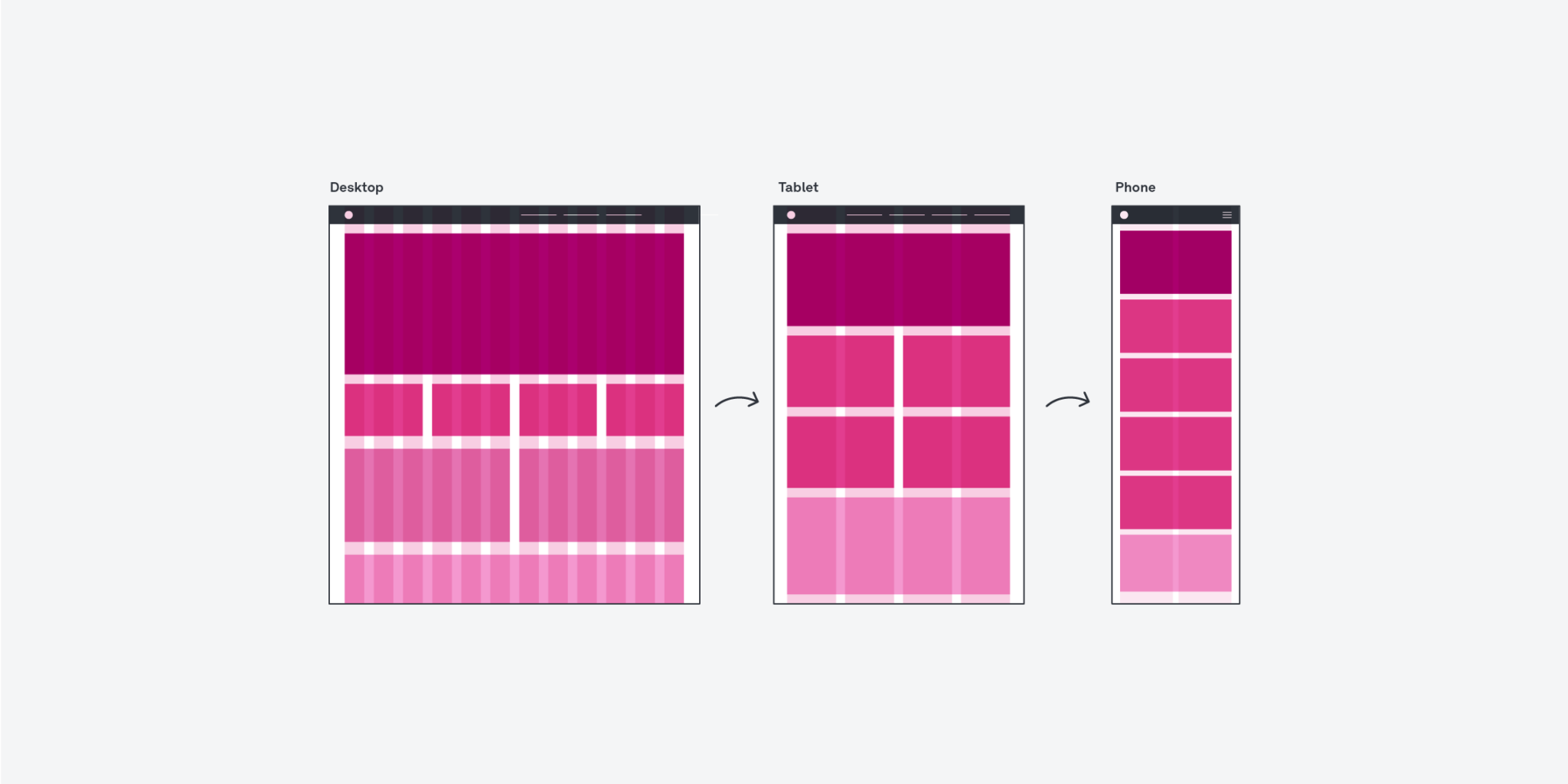
Responsive Brand System
The object shows how brand consistency and optimization depend on modular systems that can survive translation across screens.
Responsive Brand System. Localized fallback diagram used to represent responsive system thinking after the original responsive-devices image could not be mirrored automatically. Project asset fallback based on the exhibit source archive.
Collection object
Collection file
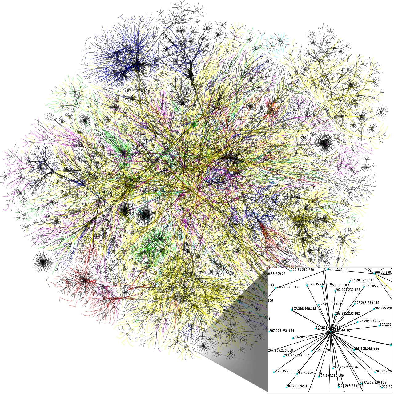
Network Abstraction
This object does not depict a single product. It represents the infrastructural imagination behind platform governance and contemporary interface logic.
Network Abstraction. Abstract system maps help visualize the hidden infrastructure behind ranking, targeting, and content distribution. Wikimedia Commons
Context module
Metrics Strip
Metrics such as click-through rate, retention, and scroll depth do not just describe performance. They shape layout, hierarchy, and what content is promoted inside the interface.
- CTR Lift: +3.2%
- Retention: 7-day
- Scroll Depth: 68%
- Test Variant: B

Context module
Signal Flow
User actions become signals, signals feed ranking models, and those models reshape what visual patterns dominate the screen. The feed becomes both interface and governance system.
- Input: Engagement signal
- Filter: Relevance model
- Rank: Predicted value
- Output: Feed order

Chronology
Optimization Timeline
- 2015
Infinite scroll becomes a dominant social interface pattern and reshapes content consumption.
- 2017
Attention economy framing spreads through design discourse and product strategy.
- 2020
A/B testing influences visual decisions at every layer of interface construction.
- 2024
Algorithmic feeds dominate brand priorities and keep optimization at the center of design work.
References
Selected source records
secondary
Attention economy (Wikipedia)Frames how engagement incentives shape contemporary design decisions.
secondary
A/B testing (Wikipedia)Explains experimentation culture behind performance-driven interface changes.
secondary
Infinite scroll (Wikipedia)Explains feed-native layouts and scroll-optimized interaction patterns.
Era commentary
What changed visually
Engagement metrics and A/B testing have altered the visual language of the web. Bold typography, simplified logos, and continuous scroll interfaces are not neutral stylistic choices; they are responses to optimization pressure.
Feeds prioritize readability at small sizes, modularity, and repeatable visual systems that support rapid iteration. That efficiency delivers clarity, but it can also produce sameness and fatigue.