Platform Standardization
The rise of social platforms shifted web design from user-shaped surfaces to standardized, systematized interfaces built for scale, clarity, and cross-device predictability.
Visual archive
Visual Archive
Platform-era design systems treated interfaces as products to be rolled out, reused, and audited. These images trace the move toward flat color, grid discipline, and component logic.
Collection object
Collection file
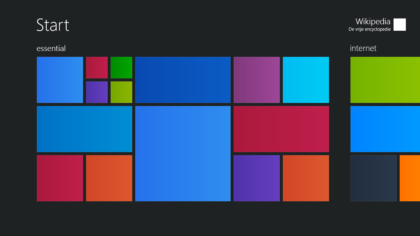
Metro Tiles
Metro distilled interface design into large type, clean color blocks, and scalable tiles, demonstrating how platform thinking converted pages into systems.
Metro Tiles. Metro tiles foreground color blocks, hierarchy, and content-first composition over decorative chrome. Wikimedia Commons
Collection object
Collection file
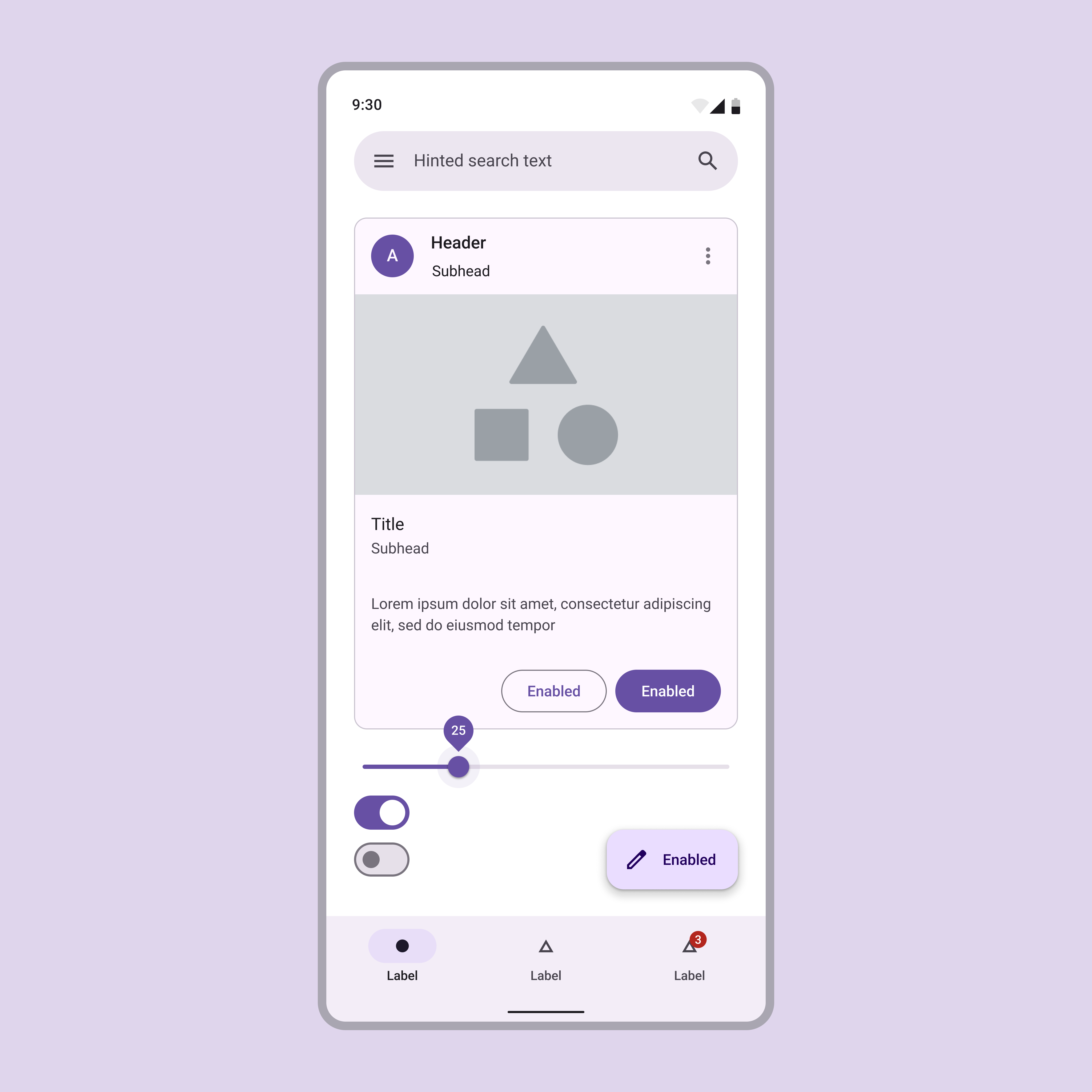
Material Components
The object turns interface design into a kit of repeatable parts. Authority now comes from consistency, documentation, and cross-product coherence.
Material Components. Material Design formalized reusable components, motion logic, and consistent visual behaviors across products. Wikimedia Commons
Collection object
Collection file
Flat Branding Example
Flat branding shows how ornament was stripped back so interfaces could travel across devices and marketing surfaces with minimal friction.
Flat Branding Example. Flat design reduced ornament, increased clarity, and made brand systems easier to scale across interfaces. Wikimedia Commons
Collection object
Collection file
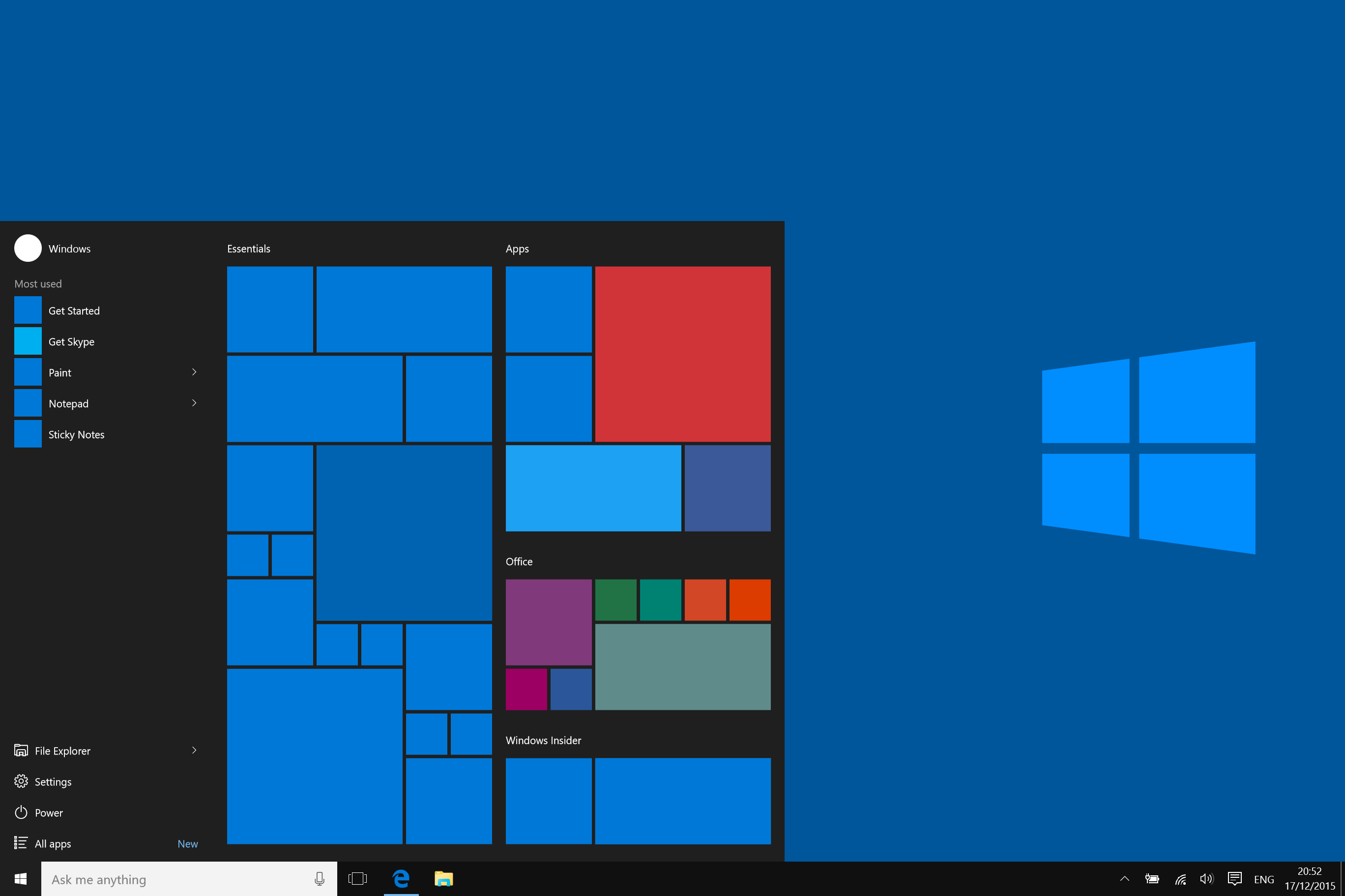
Windows App Layout
The snapped layout makes interface standardization concrete: content is now staged inside predictable modules rather than improvised page zones.
Windows App Layout. A platform-era app layout showing how modular panels and strict spacing scales standardized interface presentation. Wikimedia Commons
Context module
Design Tokens
Tokenized rules for color, spacing, type, and elevation gave teams a shared implementation language. Design decisions became portable values instead of one-off visual judgments.
- Primary color: Brand Blue
- Surface: Neutral 100
- Radius: 12px
- Typeface: System Sans

Context module
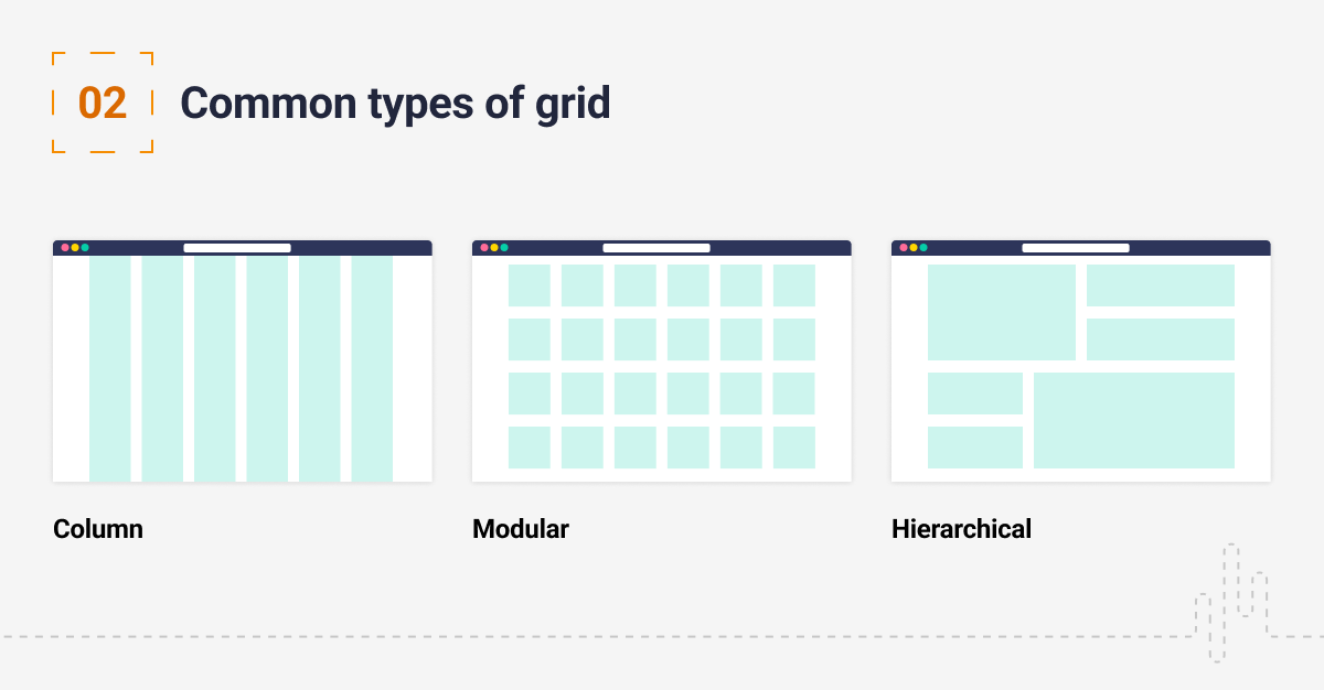
Grid Discipline
Strict grids and spacing scales made layouts predictable across devices. The point was not just elegance but operational consistency for teams shipping to phones, tablets, and desktops.
- Gutter: 24px
- Column: 12
- Spacing: 8pt scale
- Icon weight: 2px
Chronology
Milestones
- 2006
Social platforms scale standardized layouts, global navigation bars, and profile templates.
- 2010
Metro popularizes bold tiles, large typography, and content-first interface thinking.
- 2013
Flat design becomes the dominant brand aesthetic across major digital products.
- 2014
Material Design formalizes motion, depth, and responsive component behavior.
References
Selected source records
secondary
Flat design (Wikipedia)Defines flat design principles and platform-era minimalism.
secondary
Metro design language (Wikipedia)Explains Microsoft's influence on content-first, grid-based UI trends.
secondary
Material Design (Wikipedia)Documents Google's system for motion, depth, and component consistency.
Era commentary
What changed visually
As platforms grew, reusable templates and component libraries turned design into an operational system. Metro and Material championed clarity, motion rules, and unified visual languages that could scale across products.
Flat design reduced visual noise and made navigation predictable, but it also accelerated the homogenization of everyday interfaces by rewarding consistency over risk and local texture.